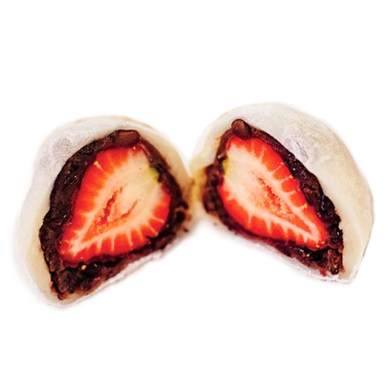
For this project, I was tasked with creating a logo for a corporation of my choice. At the time, my sister had recently taken a short trip to the Big Island of Hawaiʻi and had brought back an assortment of wonderful desserts from the infamous Two Ladies Kitchen in old Hilo Town. Two Ladies Kitchen's strawberry mochi has come to be highly anticipated form of omiyage (keepsake/memento) for families with returning friends from the Big Island of Hawaiʻi. They are the client I chose for this project.
Two Ladies Kitchen is a family business in several ways. It's origin was a family hobby to foster connection to Japanese heritage. The business culture is very personable since it's staffed by a small crew. Customers visit the confectionary to bring omiyage home to their families. Nora Uchida, the shop-owner, continues to explore new ways of making mochi—the tradition she learned from her aunt.
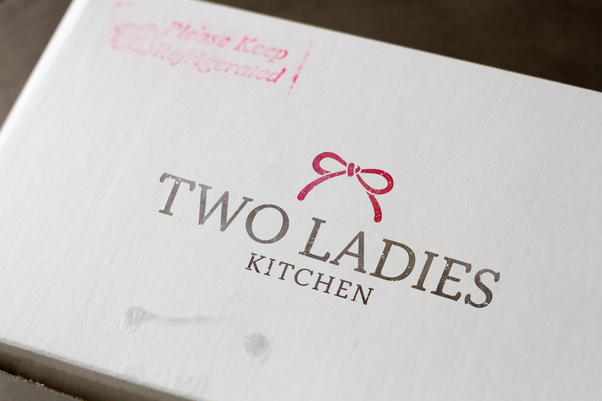
When I recieve a box from Two Ladies Kitchen's stamped with their seal, it's like hearing the words “I love you.”
Learning Two Ladies' story was an important part of my process to redesign their logo. It helped me identify core attributes of their brand, cultivate ideas based on history or folklore, and lead me into brainstorming and sketching.

The top of a gift bag with composition similar to a kamon (Japanese family crest) would represent gift-giving and roots in Japanese traditions.

Two hands together elicits the hand-crafted factor of the special mochi made fresh daily. It also represents the passing on of gifts and heritage.

The tale Tsuru no Onagaeshi is about a man who saved a crane. In return, the crane blesses him with rice which represents wealth.

Sketches of bunnies called back to the Tsuki no Usagi, an iconic figure featured in many eastern folktales. Tsuki no Usagi is commonly pictured pounding mochi.

Mizuhiki and noshi are essential elements in Japanese gift-giving. Mizuhiki is the special cord attached to or at the top of a present which symbolizes affection and togetherness.
I created three executions of my five strongest sketches. After presenting these three versions of the logo, I narrowed my focus on one logo to develop further.

The crane with hands for wings links back to folklore. The hands were positioned as if it were presenting a gift.

These two hands represent the hand-crafted nature of the mochi Two Ladies Kitchen produces and the nature in which tradition was passed on.

Two moon bunnies presenting an omiyage. The heart on the bag was carried into the final logo in the center of the ribbon.
The final logo I chose was a serious departure from the three contenders. Compared to contender #1 and #2, it was more modern and free of the retro-feel I created. I felt the it was appropriate that Two Ladies Kitchen which creates new and exciting versions of mochi should not be too closely linked to old traditions.
The ribbon carries the same sentiment as a mizuhiki at the top of a special gift. The color red was chosen because it's known to represent aloha and the Big Island of Hawaiʻi. In the center of the ribbon is a heart because I feel when I recieve a box from Two Ladies Kitchen's stamped with their seal, it's like hearing the words “I love you.”
Final Logo
Logo Details
Here are more projects for you to check out.
 Digital
 Print
Print