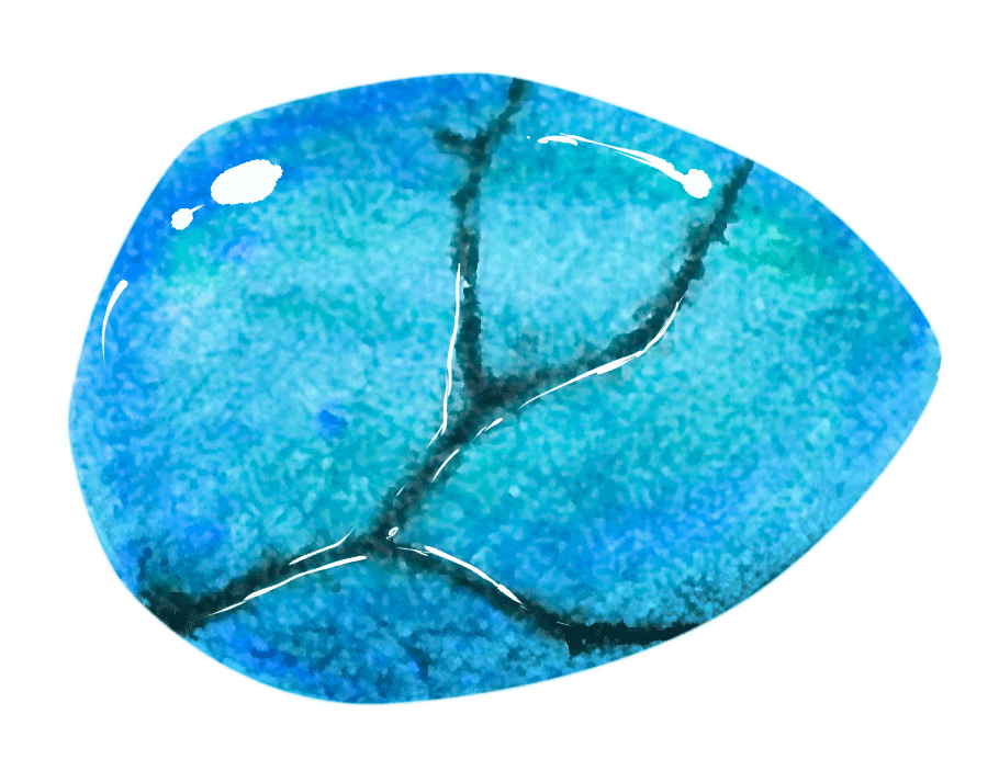

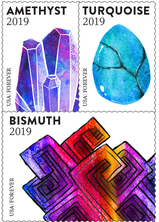
This series of USPS Stamps was designed for a group project. My group members and I worked together to decide a visual concept, illustrate, and then design the stamps together. We chose a shared interest as our concept: gemstones.
I was fortunate to have two very skilled illustrators in my group, Mony Brousseau and Venice Bagolor. We used watercolor to illustrate the gemstones because of the ability to fuse color with ease. I also tried my hand at watercolor (peep the two tiger's eye stones), but we chose to go forward with the amethyst, bismuth, and turquoise stones. We felt they gave the stamp series a diversity of shapes, colors, and patterns.
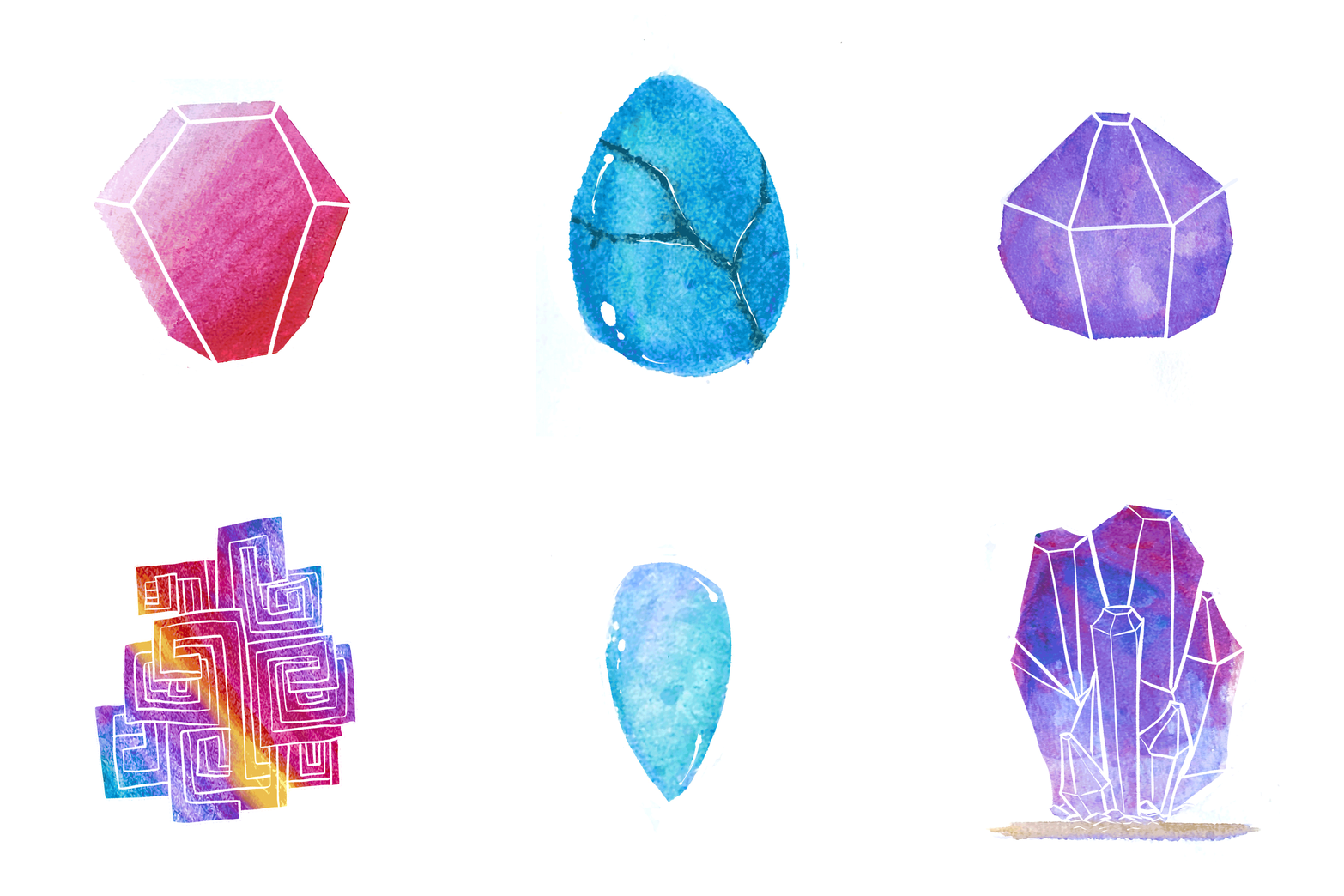
The bismuth stone needed lots of special attention in the digital phase of the process. This involved brushing up some lines, bumping up the contrast, and then inserting our images into InDesign. The fonts I selected are Brandon Grotesque and Whitman which make a polite duo.
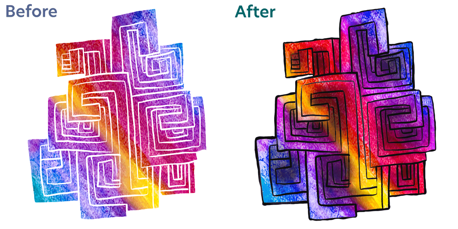
I feel the results of this project are stunning. I love how the texture of the watercolor paintings come through and the colors are beautiful.
Additionally, each of my team members contributed to the project in a way that was unique to them. It was a pleasure to bring their paintings to life within the tiny, wonderful, precious space of a postage stamp. If you enjoyed this project, please consider visiting my friends' work.
Here are more projects for you to check out.