The Identity Design

A Slap In The Face
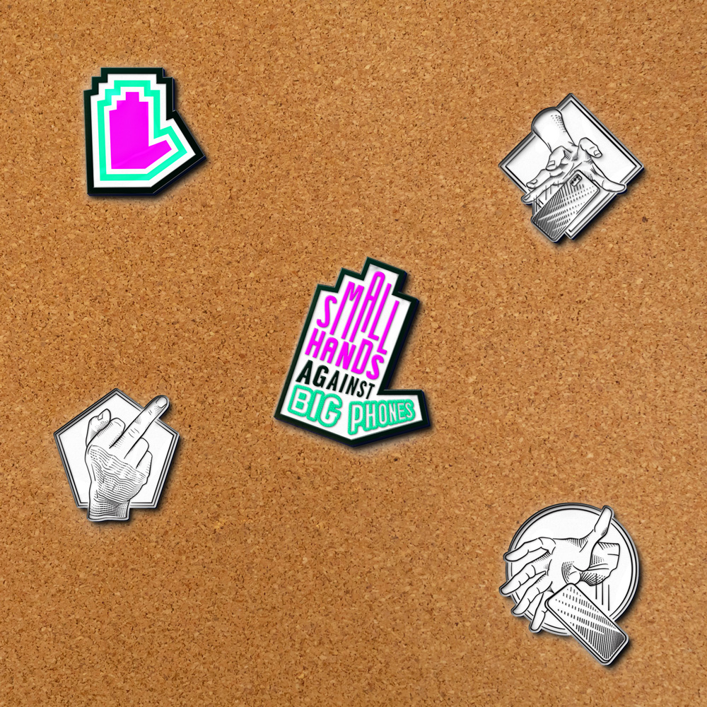
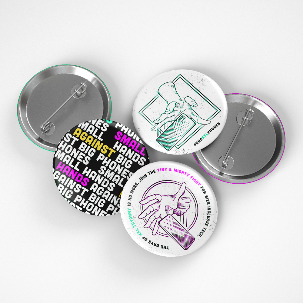
The Logo
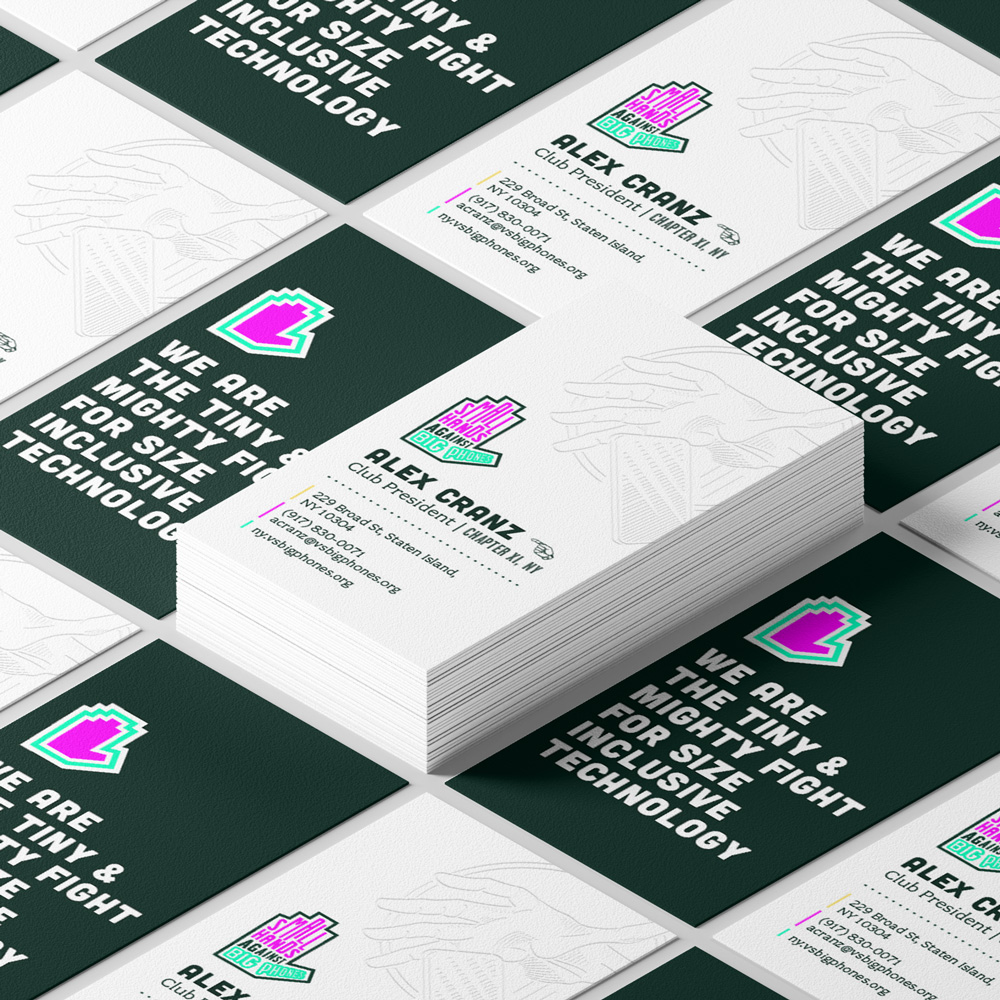
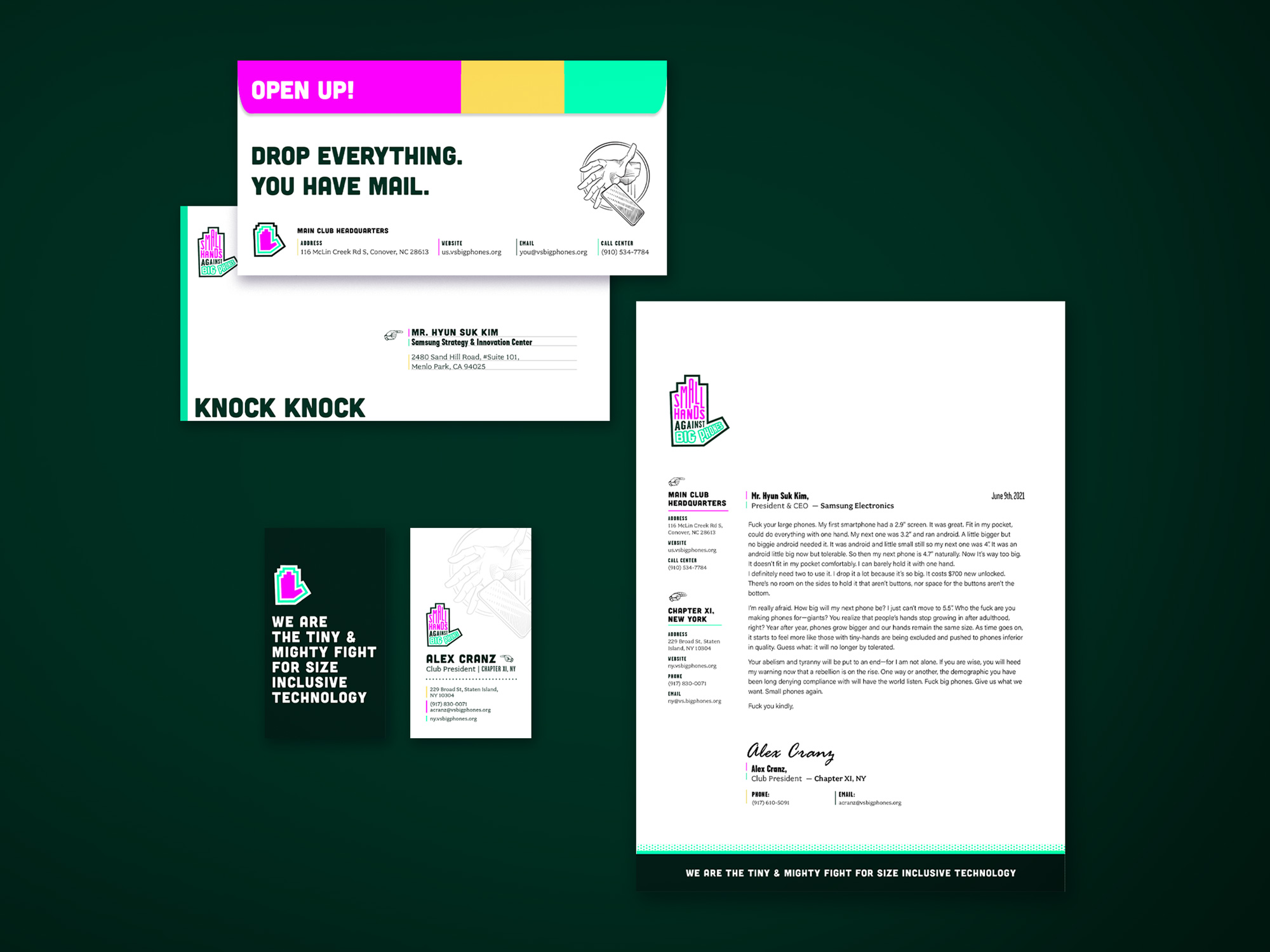
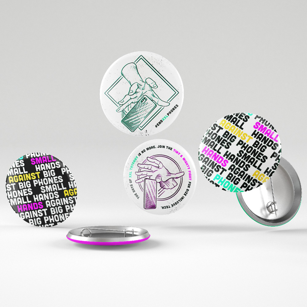
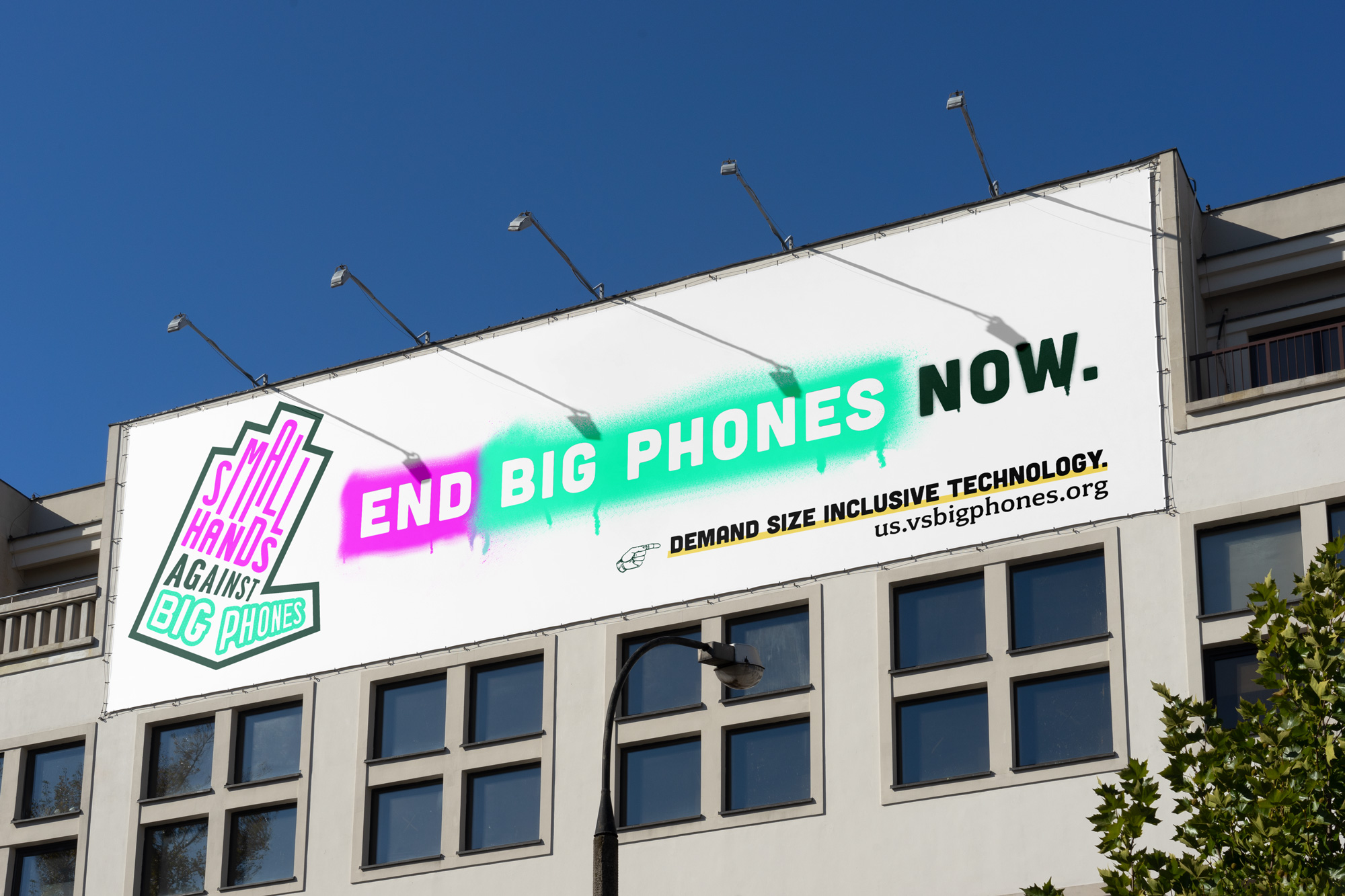
Small Hands Against Big Phones (SHABP) needed a impactful logo that's highly recognizable and expresses outrage. The high-risk approach to typography and color is inspired by the striking work of Paula Scher. It took studied negligence in order to create a coherent logo that felt spontaneous and rough around the edges. The details of the letterforms, shapes, and negative space were finely-tuned to sit harmoniously together in one shape.
Additionally, for the logo to be scalable, it needed marks that could be recognized in various sizes. I resolved to create a favicon for the smallest size, and two wordmarks.
High Contrast, Clashing, Complements
The Color Palete
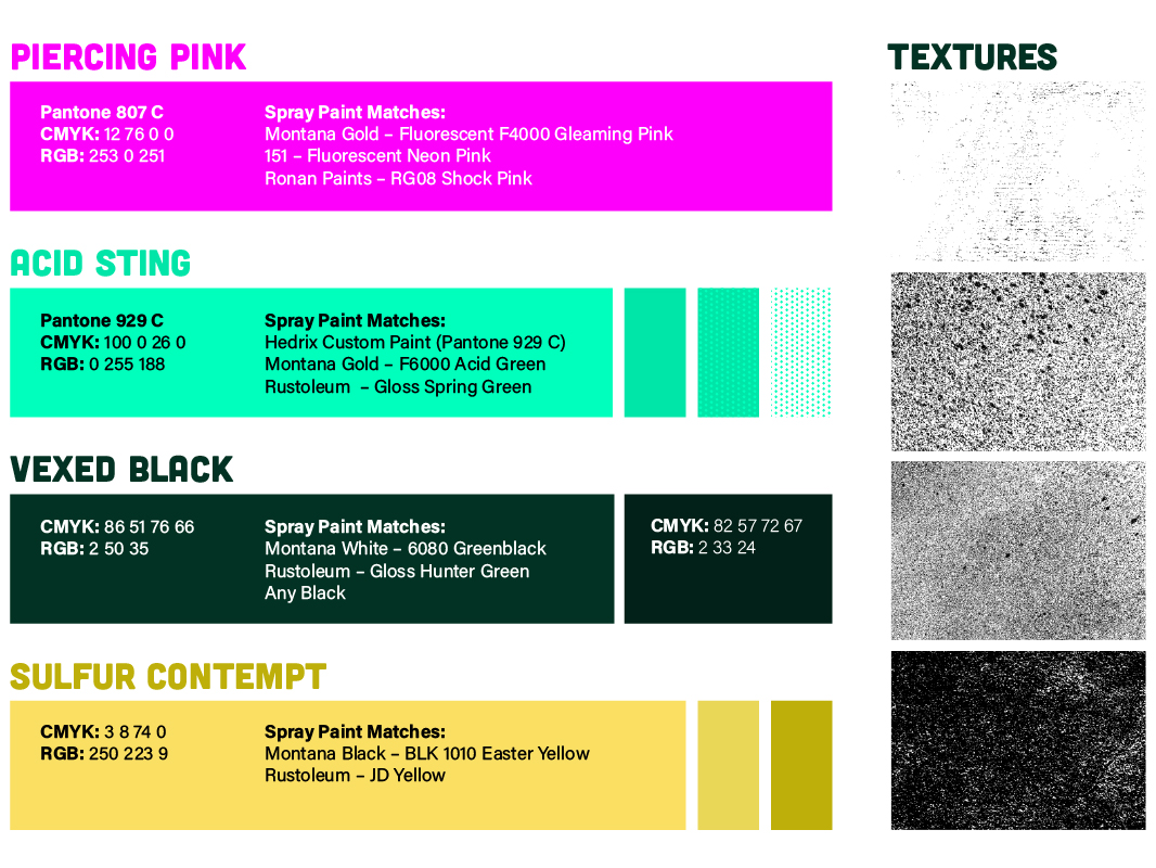
Pulling vibrant colors opposite from each other usually creates discord in a color palete as the contrast is often irksome to the eyes. I used this knowledge to curate an electrifying color palete almost on the edge of being cacophonous. Acid Sting may be used in tints or shades to allow the primary Piercing Pink to shine.
Words to arouse passion
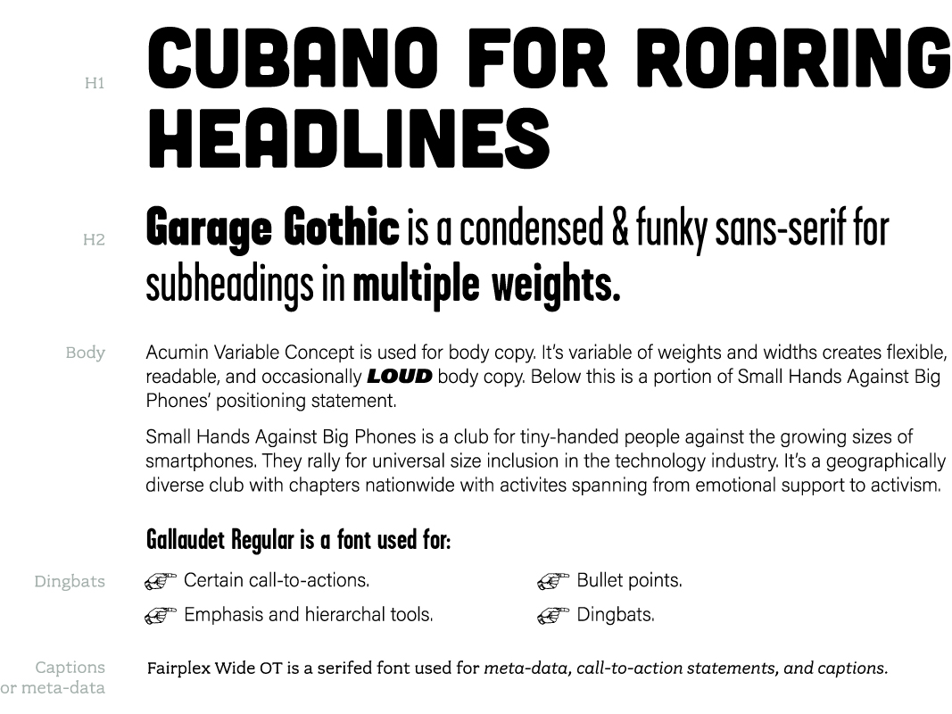
Typography
Words are powerful! The typography of SHABP needs to support a lot of information to relay their words to a wide audience. Contrast, legibility, and volume were prioritized while creating the typographic style of SHABP.
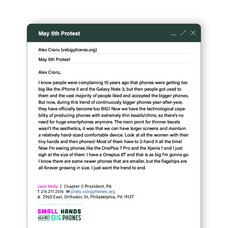
Cubano is a sans-serif used for headlines. Garage Gothic is a condensed sans-serif for subheadlines. Body copy is in Acumin Variable. Fairplex Wide is a serifed font for captions and meta-data. Gallaudet is used as dingbats and bullet-points.